A network of taxis running on predefined routes.
In the winter of 2016, I was approached by the Transportation Research for Integrated Planning Lab (TRIP Lab) to design a public transit map. One of their recent project had mapped data coming from bus routes in Accra, called trotros. From the data they could collect, and based on the knowledge of the locals, we could understand that trotros where a form of organically scaling public transportation network. The bus routes were planned by a city wide authority, while individual bus routes where ran by individuals. From how I understand it, we could compare this to a fleet of privately owned taxis, running on predefined routes. In theory, this looks like a formidable idea, although it had some drawbacks from a mapping and design perspectives. I should mention that I wasn't able to experience any of it physically, therefore my lens only involves looking at this design challenge from a data viz perspective.
The brief involved creating a map that would serve to understand the extent of the trotro network. Rather than focusing on the accuracy of the map, the goal was to rather show the potential for designing a map that was readable and easy to understand. Whether I was able to achieve this goal is still debatable, but the outcome certainly was interesting to look at!
Existing infrastructure
The main challenge with a scalable and organic bus network is that it becomes challenging to keep up with its expansion, and subtle modifications that would happen over time. Bus drivers would sometimes take small detours to accommodate riders, or avoid some traffic. Given this context, even the data collected using GPS and a phone app would pick up these inconsistencies and make it difficult to understand the main planning of the bus network. Additionally, whether all routes were in operation or not at the moment of data collection remained unknown because there were no global systems or timetables imposed upon the drivers.
Mapping the network
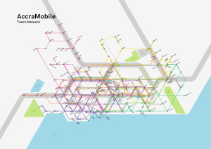
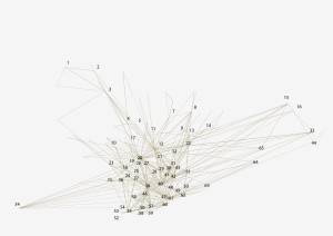
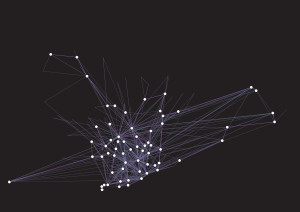
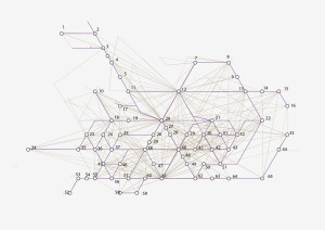
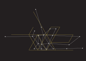
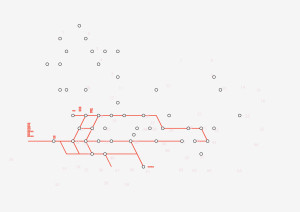
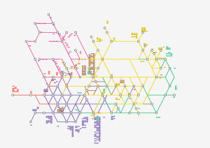
The TRIP Lab team had previously mapped these routes with a GPS and a stop log to know approximately how many, and which bus routes were active, as well as where they were stopping. With the data, they were able to produce a map of the network. The result of this exercise was a complex network of spaghetti lines that were geographically accurate, but difficult to follow. The only tags present were at the beginning and end of the routes, with no clear indication of where bus routes connected, where they shared a street segment or terminus or simply where they stopped
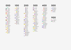
The first step was to understand the data collected during this mapping. Officially, route numbers go up to the 900s, but in actuality, there are less than 900 routes. The first observation was that there existed a densification of the routes towards the city center, as well as on the main highways and major intersections of the city. I wanted to know how the bus routes interacted with each other, and how commuters in Accra could benefit from a better understanding of these interactions.
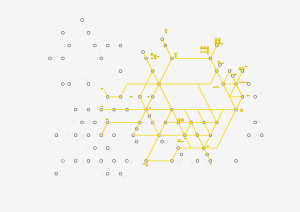
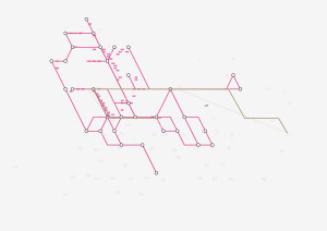
The TRIP Lab provided me with a slightly untangled version of the map that represented roughly the stops and terminuses for the bus routes. This map showed how the bus routes interacted together and formed a rough hexagonal shape in the city center, with routes that extended beyond in the sprawls of the city.
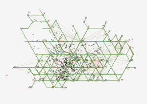
I designed a network of 21 nodes that joined in a hexagonal shape in the city center. I had this map printed in large format, and started individually tracing routes so that they followed as best as possible the network of 21 nodes. This method was not optimal. I had to manually combine data from the terminus node map, the geographically accurate bus routes map, as well as with geographical data about roads, neighborhoods and landmarks. In a better world, the process could have been done programatically. Along the way, 44 extra nodes were created to better represent unique terminuses that had different names. So there it was: a network of 65 nodes. I just had to make it look nice.


Schematizing the network
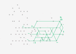
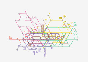
As we remember, this project was about designing a neat looking map to inspire a need for good visual communication of the public transit service. In a sense, it was never made to be useful or precise: It was made to be inspirational. With this information in mind, I knew the best approach to this would be inspired by modernist schematized maps. Maps such as Harry Beck’s London Tube map of 1920, as well as its contemporary descendant. Massimo Vignelli’s MTA map for New York of 1972. But surely the most influential maps were Vignelli’s Washington Metro trial maps. This is where I got the idea to use a 60° grid. This grid could fit the hexagon of Accra’s Trotro network, as well as provide control over the extension of the network beyond the city center.

To help navigation, I split the network in six regions, roughly taken from the main nodes identified previously. North-East, East, South, South-West, West, North-West and center. In the city, these regions would also correspond to different areas along highways, landmarks or waterfronts. This segmentation into six pieces also helped understand how all these areas joined in the city center. Doing this, I also found out that multiple routes were taking similar paths across the city, between Accra’s city center and Kotoka International Airport, along highways and main arteries. In trying to help navigation, I ended up discovering patterns in the network that were previously invisible to me.
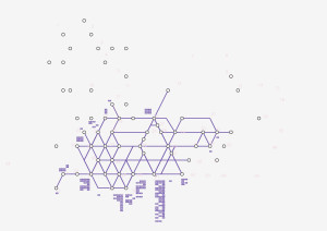
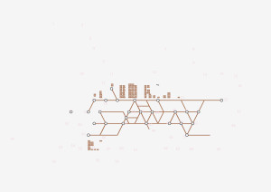
After schematizing the map, I ended up cleaning up my file, aligning and offsetting lines so they would not overlap and create false connections. I added route numbers onto the actual lines, so that we would understand which lines took what paths. I tried to add a tag at the beginning and at the end of each route. Some lines had different paths for round-trips, which added further complexity to the map.


Conclusion
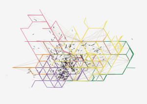
The final result is very pleasing and interesting to watch. Today, two years after the completion of this project, I still find it interesting to watch this map, and I still would like to know if it did inspire any sort of automated mapping project as we intended from the start. I find the idea of an organically scaling transit network fascinating. Especially when I see nearly empty buses driving around the sad Canadian suburb I live in, and keep wondering if the problem is the city, or the transit system...